Loading service0%

Transform your product strategy into designs users trust, value, and engage with.
Our design consultation services include the execution of visual and interaction design for your product, which includes the UI, systems, brand identity, and motion designs. Your team receives production-ready assets built to a consistent and scalable standard.
In 45-60 days, you'll have: A complete design system for developers, a unified visual language, and interfaces specified to your team's exact standards, enabling development without ambiguity.

A complete design system for developers.

A unified visual language across your product.

Interfaces specified to your team's exact standards, enabling development without ambiguity.
The product is built. But the interface looks inconsistent across screens, such as buttons styled differently, spacing that shifts between sections, and a visual language that doesn't hold together. It works, but it doesn't feel considered.
There was no design system behind the build. Every screen was designed in isolation by whoever was working on it at the time. Without a shared component library and visual standard, inconsistency compounds with every new screen added.
A brand identity exists. But across the product, the website, and marketing, it reads like three different teams made three separate decisions. Nobody defined how the brand translates into digital product design.
Brand guidelines and product design were treated as separate workstreams. One produced a logo and colour palette. The other produced an interface. Neither was defined with the other in mind, so the product carries the brand without expressing it.
The product is built. But the interface looks inconsistent across screens, such as buttons styled differently, spacing that shifts between sections, and a visual language that doesn't hold together. It works, but it doesn't feel considered.
There was no design system behind the build. Every screen was designed in isolation by whoever was working on it at the time. Without a shared component library and visual standard, inconsistency compounds with every new screen added.
A brand identity exists. But across the product, the website, and marketing, it reads like three different teams made three separate decisions. Nobody defined how the brand translates into digital product design.
Brand guidelines and product design were treated as separate workstreams. One produced a logo and colour palette. The other produced an interface. Neither was defined with the other in mind, so the product carries the brand without expressing it.
The result? You get a product that works but feels lower quality, forcing developers to make design choices and creating inconsistent experiences.
Or worse, rebranding misses the mark on consistency, so issues return and erode user trust as the product grows.
[DESIGN THINKING = PROBLEM SOLVING]
Good design consulting services start with what the product needs to communicate before deciding what it needs to look like. Before a component is built or a screen is designed, we need to understand the product, the users it serves, the brand it represents, and the development environment in which it's being built. Four principles shape every product design consulting engagement:
A screen designed in isolation is a one-time solution. However, a design system is a reusable answer to every screen that follows. We prioritize building the component library, visual language, and interaction standards so every future screen is consistent by default.
Visual language from marketing rarely transitions into digital product design without interpretation. We define how your brand acts at the interface level, components, motion, and hierarchy, so your product feels authentically branded.
Closer to Your Brand Targets
Individual screen designs alone don't achieve the desired goal of engaging the users with the design. With Olio NeXus, every product design consulting engagement produces a component library that your development team can extend as the product grows.
Our designers have extensive experience working with the development and engineering teams. Therefore, they document design files as crucial assets (not just a formality), with proper spacing, named components, and annotated interactions.
Our creative design consulting centres around your brand identity, or defines an identity alongside the product design. As a result, the visual language holds from the first screen a user sees to the last interaction they complete.
Every engagement in the design consultation service follows the same sequence, moving from foundation to handover.
Phase 01
We begin by understanding your product, users, brand, and development needs. If a UX strategy exists, we use it; if not, we define the parameters before design work starts.
Phase 02
We set the visual foundation (color, typography, icons, spacing, interaction rules), translating or defining identity as needed.
Phase 03
(Design Consulting: All Deliverables Defined)
01
The foundational design decisions for the product include the colour system, typography scale, iconography style, spacing framework, and the principles governing how visual elements relate to each other.
Why It Exists:
Without a documented visual language, design decisions get made individually by whoever is working on each screen. This document is what holds the product together visually as it scales.
Business Impact:
Every designer, developer, and stakeholder works from the same visual standard; new screens feel like they belong to the same product, not like they were added later.
Risk Mitigation:
Prevents visual inconsistency from compounding as the product grows and more people contribute to it.
02
A complete library of UI components in which every element the product uses is built to cover all states, documented with specifications, and organised for the development team to build from directly.
Why It Exists:
Without a system, every new screen requires new design decisions. With one, new screens are assembled from what already exists, which is what makes digital product design scalable.
Business Impact:
Development moves faster because components are defined and ready. Design reviews are faster because consistency is built in rather than checked afterward.
Risk Mitigation:
Eliminates the inconsistencies that accumulate when developers make design decisions without a defined component library.
03
Production-ready screen designs for every flow and state the product requires, which are assembled from the component library, annotated with specifications, and exported in the format the development team builds from.
Why It Exists:
Files that are unclear or missing states require designers and developers to resolve ambiguity in real time, slowing the build and introducing decisions that should have been made during UI design consulting.
Business Impact:
Developers work from precise specifications, reducing iteration cycles and delivering higher-quality releases faster.
Risk Mitigation:
Edge cases and component states resolved in design take minutes to address. Resolving them during development takes days.
04
Documented interaction behaviour and motion design across the product (transitions, micro-interactions, feedback animations, and loading states) with timing, easing, and trigger specifications.
Why It Exists:
Motion without specification is interpreted differently by every developer who implements it, resulting in an inconsistent feel that's difficult to diagnose and time-consuming to address.
Business Impact:
The product feels consistent in its response to user actions, which contributes more to perceived quality than most visual decisions.
Risk Mitigation:
Prevents the post-launch polish cycle that occurs when motion behaviour isn't specified, and implementations vary across the product.
05
Organised, annotated design files with full specifications (spacing values, colour tokens, typography styles, component states, interaction notes, and exported assets) prepared specifically for the development team building the product.
Why It Exists:
A handover package is structured around the questions a developer will ask, not the questions a stakeholder will ask. The distinction matters when the build starts.
Business Impact:
Development starts with everything it needs, with no ambiguity to resolve, no missing states, and no designer required in every sprint to answer questions that the file should already answer.
Risk Mitigation:
Reduces the design-development back-and-forth that typically adds weeks to a build timeline.
01
Visual language is defined. Design system foundations built. First screens designed and reviewed against the brief. The development team aligned on what they're building from.
02
The full component library is complete. All primary flows are designed and handed over. Development underway against production-ready files.
03
Complete UI across all product flows live in the build. Motion and interaction behaviour implemented to specification. Design system in active use by the development team independently.
You're building something new and need a visual language and interface that communicates quality from the first screen. Starting with a proper design system means every screen you add from here builds on a foundation rather than departing from one.
The product has grown past what the original design supports. Inconsistencies have accumulated, and the visual language hasn't kept pace with the brand. You need product design consulting that reflects where the business is now and scales with where it's going.
The product exists. Design was done screen by screen without a system. Every new feature requires design decisions that should already be resolved. A design system built retrospectively gives the development team a defined standard to work from going forward.
You have more than one product, more than one team, and a brand that should feel consistent across them all. Design thinking consulting at this scale defines the system, the standards, and the governance that make consistency achievable, without requiring every team to manually coordinate every decision.
We deliver specialized AI consulting across high-impact sectors:
 Industrial & Manufacturing
Predictive maintenance, quality control automation, and supply chain intelligence systems.
 Engineering & High-Tech
Enhancing innovation, performance, and efficiency through AI-driven engineering and automation.

A B2B SaaS company had been building its platform for three years. Design had always been done screen by screen. A designer would produce mockups for each new feature, hand them over, and developers would build.
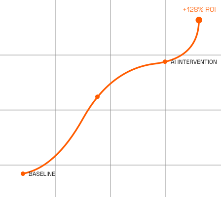
A B2B SaaS company had been building its platform for three years. Design had always been done screen by screen. A designer would produce mockups for each new feature, hand them over, and developers would build. Every new feature required the same back-and-forth: missing states, undefined edge cases, inconsistent component behaviour that only surfaced once the feature was in development.
What our design audit found:
We assessed their operations and mapped use cases for AI, and discovered:
WE BUILT
A design system retrospectively, auditing what existed, standardising into a defined component library, documenting the visual language, and restructuring the Figma workspace around the system rather than individual features.
MEASURABLE IMPACT
Design-to-development handover cycles dropped by 52% within two product sprints. The 34 button variants were consolidated to 6. Developers stopped raising design questions mid-sprint because the handover files answered them. The design team started shipping more screens at the same time because they were assembling from components rather than designing from scratch.
Whether you're starting from scratch, scaling an existing product, or standardising across multiple platforms, bring us your brief, your existing brand, or your product as it stands.
Share Your RequirementsUI/UX design consulting defines what the experience needs to do, including research, journey mapping, usability testing, and strategy. Design consulting services execute the visual and interaction design from that direction. The two are designed to connect within the NeXus Build journey, but either can be the starting point depending on where you are in your build process.
Not always. What we need before design begins is a clear understanding of what the product does, who uses it, and what the development team needs to build from. If that clarity doesn't exist yet, we establish it at the start of the engagement before any visual work begins.
We work in Figma, Adobe XD, Sketch, Framer, and AI-assisted design tools that accelerate output without compromising quality. Handover files are delivered in whatever format your development team builds from.
A design system covers the complete set of visual and interaction decisions for a product, including colour tokens, typography scale, spacing framework, iconography, component library, interaction patterns, and motion specifications. It's the single source of truth your development team references for every screen they build.
A visual language and initial component library typically takes 1-2 weeks. Full UI design across all flows, motion specifications, and developer handover runs 4-8 weeks, depending on product scope. We confirm the timeline after reviewing the brief and analysing the product complexity, along with the number of flows, as the primary variables.
We deliver production-ready files in your development team's preferred format. It's organised, annotated, and exported with full specifications covering spacing, colour tokens, typography styles, component states, and interaction behaviour. The package is structured around what developers need to build, not what looks good in a design review.
Yes. If brand guidelines exist, we translate them into a digital design language, defining how the brand's visual identity behaves at the component and interaction level. If guidelines need updating or don't yet exist, we define the visual language during the product design consulting engagement, within the same scope.
Not just the actual designs, we structure every file and detail for the development team, with named layers, organized components, annotated interactions, and documented specs. Our handovers are genuinely production-ready, and they will not feel the need of contacting the designer multiple times.
Design decisions that work for ten screens need to work for a hundred. Every component, pattern, and visual decision is evaluated against what the product will need to support as it grows, and not just what it needs today.
The decision to design dynamic motion and interactive elements is carefully made to serve a navigational or brand-narrative purpose. Our criteria: the visually stunning elements must ease product navigation, inspire user actions, and guide their attention.
We build a component library, assembling screens from complete UI elements and documenting each for developers.
Phase 04
With the system in place, we design all required screens and flows from the library, ensuring consistency and a strategy-driven approach.
Phase 05
We define and document motion and interactions across the product, including specs for timing, easing, and triggers.
Phase 06
Files are prepared and annotated for development, covering all key design specs. Developers need nothing extra from design.
Build scalable learning and administration platforms.
 Real Estate
We assess where AI reduces support costs, improves property management, and scales real estate operations.
 Healthcare
Clinical decision support, patient flow optimization, and medical image analysis solutions.